As the weather is warming up I thought I would investigate heat waves recorded in my data for Mallacoota. These data include BoM data for Mallacoota, at the station near the Airport, from 1993 until January 2019 and data from my Weather Station (WS) since then.
I have found that my WS records somewhat higher daily maximum temperatures than the BoM site, most likely due to the greater exposure of the BoM site to cooling sea breezes, so used regression analysis to calculate adjustment factors. My expectation is that the two series are now consistent.
Definition of a Heat Wave
The BoM Glossary defines heat wave as “A period of abnormally hot weather lasting several days.”. They a more specific in their knowledge centre which defines a heat wave as “A heatwave occurs when the maximum and the minimum temperatures are unusually hot over a three-day period at a location.”
I have restricted my investigation to the 5 warmer months, November through March.
The more specific definition seemed to require quite a lot of calculation to assess over the in-scope 4314 days so I simplified the definition to begin my investigations to make it “a period of three consecutive days of significantly above the long term average temperature for a month”. I have defined significance as being 1 Standard Deviation (SD) greater than the mean.
After completing the work only using Maxima I made a second foray incorporating Minima into the process. That seemed to work quite well so this report covers both. I shall refer to the two phenomena as “Hot Spell” when only using Maxima and “Very Hot Spell” when Minima are also incorporated.
Boundary values
I calculated the average maximum temperature for each month, the SD of that average and 2 potential upper bounds, equivalent to (mean +1.96SD) and and (mean + 1 SD). For this to work in a “pure” sense the distribution of maximum temperatures should be approximately normal: that isn’t the case as shown in the following example, using January data.
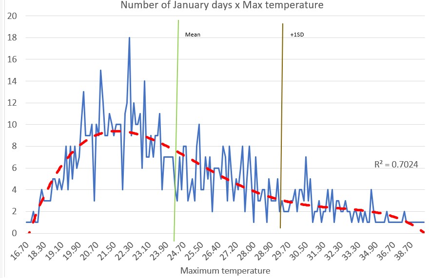
For my purposes I don’t think that matters as values to the right of the gold vertical line are clearly “significantly” greater than the average (ie mean, 24.5C). (The median value is 23.7C while the mode lags back at 22.2C). The table ‘Boundary Values Maxima’ in the Google Sheet “Heat Waves and Similar Phenomena “ sets out the actual values.
Hot Spells
Process
I used ACCESS to extract all the maximum temperatures for the relevant months and to compare the maxima with the boundary values for each month. I termed the values which exceeded the boundary value without considering the number of consecutive days as Potential Heat Wave Days. They are shown in the appropriate table in the linked Google Sheet.
I then extracted the records (date and maximum value) which exceeded the boundary value and clerically scanned the dates for strings of three or more consecutive days of high values. I consider the dates which form these strings as Actual Hot Spell Days and the incidence of these x year is shown in the appropriate table in the linked Google Sheet.
In some cases the runs crossed a month limit: for example in 2021 December 30 and 31 exceeded the December boundary of 26.75C and in 2022 January 1 and 2 exceeded the January limit of 28.98C. I have scored that as a run of 4: the alternative approach of requiring the December maxima to exceed the January boundary is perhaps ‘nicer’ but:
The difficulties with the distribution of maxima probably result in far greater dodginess than this; and
No sheep stations nor, more relevantly for Mallacoota, luxury holiday homes are riding on the outcome of this investigation.
So near enough will do.
The final step was to count up the number of ‘heat wave days’ (HWD) in each past month. In this case a HWD is simply part of a string. In the example discussed above the string which bridged the New Year counted 2 days in December 2021 and 2 days in January 2022. This can result in a month having 1 HWD as part of a string and the rest of the month not being in a string: an example is in February 2020 where a three day string covers January 30 to February 1.
Outcome for Hot Spell Days
As noted above I have put the values for each month in 2 table in the linked Google Sheet. An easy way to look at the outcome is through the following chart comparing Potential and Actual Hot Spell Days.

It is to be expected that the number of actual Hot Spell Days is less in every year than the number of potential days. It is of interest - but I think to be expected from the process - that there are at least a few Potential days in every year. It is not surprising that in some years there are no Hot Spells.
In neither series is the value of r2 such that I consider the trend significant.
Very Hot Spells
Process
In essence I followed the same process to identify the Boundary Values for Hot Minima (see table in the Google Sheet) a set of days with Minima above the boundary and to then match the days in that set which also had hot maxima. This set was then searched for runs of 3 days or more.
A comparison between Hot Spell Days (maxima only) and Very Hot Spell Days (Maxima and Minima above average) is shown in this chart.

The addition of the criterion for minimum temperatures has caused a significant decrease on the number of Days caught by the process. Again the value of r2 for the Very Hot series is not significant.
The impact of criteria
Overall I have examined data for 4314 days and identified 44 Very Hot Spell days. To illustrate how the various criteria (Maxima and Minima over boundary levels and 3+ day runs) work to give this result I have created a tree diagram.

No comments:
Post a Comment
Comments are welcome but if I decide they are spam or otherwise inappropriate they will not be approved.